
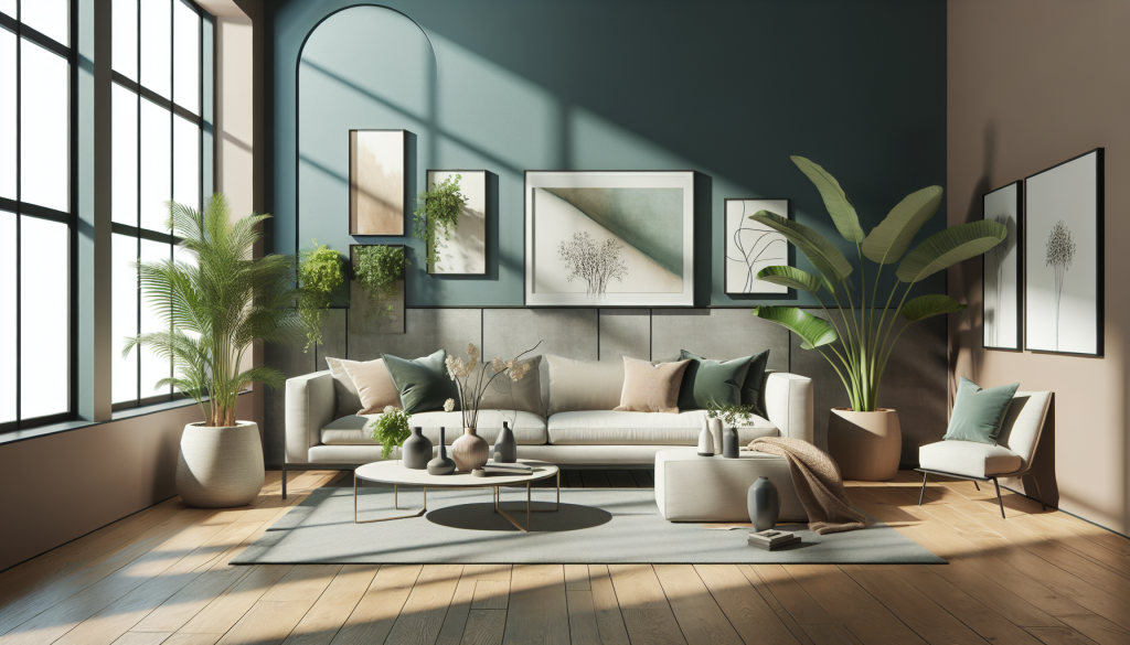

Interior design is deeply tied to human psychology. The colors, textures, lighting, and spatial layouts we choose directly influence our daily emotional state, energy levels, and sense of comfort. When planning a home renovation or room refresh, homeowners frequently find themselves at a crossroads between two dominating aesthetic spectrums: moody and bright.
While a moody aesthetic relies on saturated hues, dark paint colors, ambient shadows, and rich textures to create an intimate atmosphere, a bright aesthetic uses crisp whites, soft neutrals, reflecting light, and uncluttered layouts to evoke a sense of spacious airiness. Selecting the right direction requires evaluating natural light, room proportions, architectural details, and how you intend to live within the space.
Unpacking the Moody Interior Aesthetic
Moody design, often associated with concepts like color drenching, gothic elegance, or modern dramatic minimalism, embraces depth rather than avoiding dark spaces. Far from feeling gloomy, a executed moody room feels warm, enveloping, and intentional.
Core Elements of Moody Design
-
Deep Color Palettes: Moody spaces utilize saturated paint tones such as charcoal gray, deep navy blue, forest green, rich plum, espresso, or matte black.
-
Color Drenching: A popular design technique where paint is applied uniformly across walls, baseboards, crown molding, doors, and even ceilings to create an uninterrupted envelope of color.
-
Low Contrast and Layered Lighting: Rather than relying on bright overhead ceiling lights, moody spaces use targeted ambient lighting, such as table lamps, wall sconces, floor uplights, and dimmable accent fixtures.
-
Tactile and Heavy Textures: Deep colors are paired with rich fabrics like velvet, boucle, distressed leather, dark stained woods, brass hardware, and heavy wool drapery.
Best Rooms for a Moody Aesthetic
Moody aesthetics excel in spaces intended for relaxation, evening entertainment, or quiet focus. Home libraries, dedicated home offices, media rooms, formal dining rooms, powder rooms, and primary bedrooms are ideal candidates. In these environments, dark colors reduce visual distraction and foster a cozy atmosphere.
Unpacking the Bright Interior Aesthetic
The bright aesthetic draws heavy inspiration from Scandinavian design, coastal minimalism, and modern farmhouse principles. It prioritizes maximizing natural daylight, promoting clean visual lines, and creating an expansive feeling regardless of square footage.
Core Elements of Bright Design
-
Light and Neutral Palettes: Walls are typically finished in soft off-whites, warm creams, subtle grays, or gentle pastel undertones that reflect light across the room.
-
Maximizing Daylight: Sheer window treatments, unadorned glass panes, and strategically placed wall mirrors amplify available daylight throughout the day.
-
High Visual Contrast: While base colors remain light, contrast is introduced through thin black metal accents, natural wood grains, woven basketry, and vibrant indoor greenery.
-
Open Spatial Layouts: Furniture layouts prioritize clear walkways, minimal clutter, and low-profile silhouettes to maintain an unobstructed flow of sightlines.
Best Rooms for a Bright Aesthetic
Bright aesthetics perform exceptionally well in active, daytime living areas. Kitchens, open-concept living rooms, breakfast nooks, sunrooms, and children’s playrooms benefit from the invigorating energy that bright, reflective surfaces provide.
Key Factors to Consider When Choosing Your Aesthetic
Determining whether to go moody or bright involves assessing physical room parameters alongside your lifestyle preferences.
1. Evaluating Natural Light Exposure
The orientation of a room’s windows plays a critical role in color performance:
-
North-Facing Rooms: Receive cool, diffused light throughout the day, which can make light gray or cool white paint look flat and sterile. North-facing rooms are prime candidates for rich, moody colors, as dark paint inherently thrives in muted light.
-
South-Facing Rooms: Enjoy intense, warm sunlight all day long. These spaces accommodate bright whites effortlessly without looking washed out, but can also handle saturated dark paint if you prefer a bold look.
-
East-Facing Rooms: Receive warm morning light followed by cooler afternoon shadows. Bright aesthetics work well for morning spaces like breakfast nooks, while moody tones suit afternoon living areas.
-
West-Facing Rooms: Experience cool morning light followed by intense golden afternoon light.
2. Room Size and Ceiling Height
A common interior design myth claims that dark paint makes small rooms look smaller. In reality, dark colors blur room boundaries because corners melt into shadows, creating an illusion of infinite depth. However, if a low-ceilinged room lacks sufficient artificial lighting options, a bright aesthetic with light walls may keep the space feeling open.
3. Functional Purpose and Time of Use
Consider when you use the space most. If a room is utilized primarily in the evening after work, such as a cozy den or primary bedroom, a moody palette complements nighttime relaxation. Conversely, if you spend mornings and mid-days working or cooking in the space, a bright aesthetic aids alertness and productivity.
4. Existing Architectural Features
Exposed brick walls, detailed ceiling beams, intricate millwork, and original hardwood flooring provide great texture. Moody designs accentuate intricate trim work by enveloping it in dark paint, while bright designs allow architectural elements to stand out as dark focal points against pale walls.
How to Successfully Mix Both Aesthetics in One Home
You do not need to commit your entire residence to a single aesthetic. Transitioning between bright and moody rooms throughout a home creates a dynamic, multi-dimensional living environment.
To maintain cohesion across different spaces:
-
Establish a Common Thread: Keep flooring material uniform throughout main hallways and living areas, or maintain consistent hardware finishes (such as unlacquered brass or matte black) across all rooms.
-
Use Transitional Spaces Intentionally: Enclosed hallways, entry vestibules, or small powder rooms act as buffer zones between bright living areas and moody retreats.
-
Balance Light and Dark Within Each Room: A moody room requires light-colored textiles, light rug grounding, or natural wood to prevent feeling cave-like. Similarly, a bright room needs dark metal accents, deep wood stains, or dark artwork frames to prevent feeling flat or sterile.
Frequently Asked Questions
Will painting a small room a dark, moody color make it feel claustrophobic?
Not necessarily. While light paint reflects light to open a space, dark paint absorbs light and visually erases corners and wall boundaries, creating an illusion of depth. As long as you incorporate varied lighting layers and contrasting light furniture or artwork, a small dark room feels cozy and dramatic rather than claustrophobic.
How do I choose the right white paint for a bright aesthetic?
White paint falls into two main categories: warm whites (containing yellow, red, or beige undertones) and cool whites (containing blue, green, or gray undertones). For rooms with limited natural light or northern exposure, choose warm whites to prevent a cold, sterile appearance. Reserve crisp, cool whites for rooms with abundant direct sunlight.
What lighting color temperature works best for moody interiors?
Moody interiors perform best with warm white light bulbs rated between 2700K and 3000K on the Kelvin scale. Cool white light bulbs (4000K or higher) cast a harsh blue hue that ruins the rich, inviting warmth of dark paint and heavy textures.
Can I achieve a moody look without painting my walls black or dark gray?
Yes, moody design is not limited to black or charcoal. You can achieve a moody aesthetic using deeply saturated jewel tones like deep emerald green, rich sapphire blue, dark plum, terracotta, or warm chocolate brown.
Is a bright interior design aesthetic harder to keep clean?
Light-colored walls, cream upholstery, and pale rugs show dirt, scuffs, and pet hair more readily than dark surfaces. However, dark surfaces like black countertops or dark hardwood floors show dust, water spots, and lint much more visibly. Choosing stain-resistant performance fabrics helps maintain a bright aesthetic in high-traffic homes.
How can I test a dark or bright paint color before committing?
Never choose a paint color based on small paper swatches under store lighting. Paint large sample boards (at least two feet by two feet) using real paint samples, and move them around the room. Observe how the color shifts in both direct morning sunlight and under artificial evening lighting over twenty-four hours.
What window treatments suit a moody room best?
Moody rooms benefit from floor-to-ceiling drapery made from heavy, light-absorbing fabrics like velvet, wool blends, or thick linen. Matching the drapery color closely to the wall paint creates a seamless, uninterrupted look that enhances the room’s atmospheric feel.

Comments are closed.